初始化設定
安裝套件
1
2
3
4
5
|
dotnet add package Microsoft.Data.Analysis --version 0.23.0
dotnet add package ScottPlot --version 5.1.58
|
載入 CSV 資料
可參考這篇 DataFrame 載入 📥 CSV 資料
建立擴充方法
使用此擴充方法取得特定 Column 資料
1
2
3
4
| public static double[] GetColumn(this DataFrame df, string column)
{
return Enumerable.Range(0, (int)df.Rows.Count).Select(x => Convert.ToDouble(df[column][x])).ToArray();
}
|
引用參考
1
2
3
4
5
| using System.IO;
using Microsoft.Data.Analysis;
using ScottPlot;
using ScottPlot.Plottables;
using ScottPlot.Statistics;
|
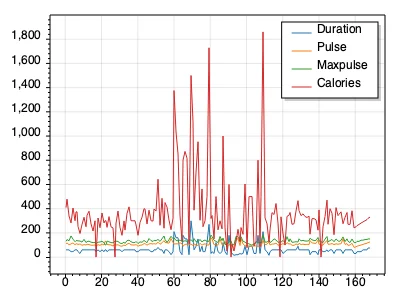
使用 SignalXY 繪圖
分析各分類分佈狀態
1
2
3
4
5
6
7
8
9
10
11
12
13
14
15
16
17
18
19
20
21
22
23
24
25
26
27
28
29
30
31
32
33
34
35
| Plot myPlot = new();
int[] rowIndex = Enumerable.Range(0, (int)df.Rows.Count).ToArray();
double[] durationsY = df.GetColumn("Duration");
SignalXY sigAll1 = myPlot.Add.SignalXY(rowIndex, durationsY);
sigAll1.LegendText = "Duration";
double[] pulseY = df.GetColumn("Pulse");
SignalXY sigAll2 = myPlot.Add.SignalXY(rowIndex, pulseY);
sigAll2.LegendText = "Pulse";
double[] maxpulseY = df.GetColumn("Maxpulse");
SignalXY sigAll3 = myPlot.Add.SignalXY(rowIndex, maxpulseY);
sigAll3.LegendText = "Maxpulse";
double[] caloriesY = df.GetColumn("Calories");
SignalXY sigAll4 = myPlot.Add.SignalXY(rowIndex, caloriesY);
sigAll4.LegendText = "Calories";
myPlot.Legend.Alignment = ScottPlot.Alignment.UpperRight;
string filePath = "SignalXY.png";
myPlot.SavePng(filePath, 800, 600);
|
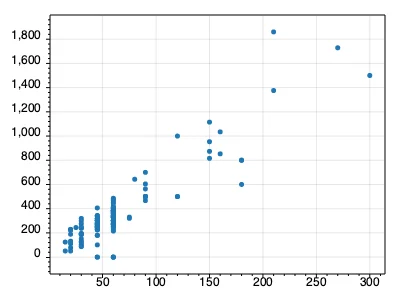
使用 Scatter 繪圖
使用「Duration」作為 x 軸,使用「Calories」作為 y 軸,分析兩者關聯性
1
2
3
4
5
6
7
8
9
10
11
12
13
14
15
16
17
| Plot myPlot = new();
double[] durationsY = df.GetColumn("Duration");
double[] caloriesY = df.GetColumn("Calories");
Scatter scatter = myPlot.Add.Scatter(durationsY, caloriesY);
scatter.LineWidth = 0;
string filePath = "Scatter1.png";
myPlot.SavePng(filePath, 800, 600);
|
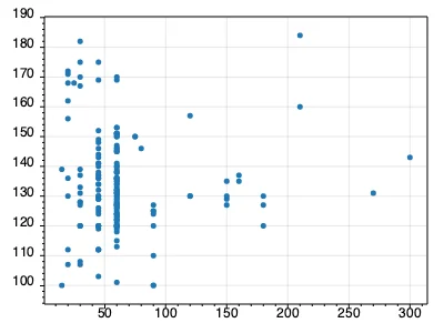
使用「Duration」作為 x 軸,使用「Maxpulse」作為 y 軸,分析兩者關聯性
1
2
3
4
5
6
7
8
9
10
11
12
13
14
15
16
17
| Plot myPlot = new();
double[] durationsY = df.GetColumn("Duration");
double[] maxpulseY = df.GetColumn("Maxpulse");
Scatter scatter = myPlot.Add.Scatter(durationsY, maxpulseY);
scatter.LineWidth = 0;
string filePath = "Scatter2.png";
myPlot.SavePng(filePath, 800, 600);
|
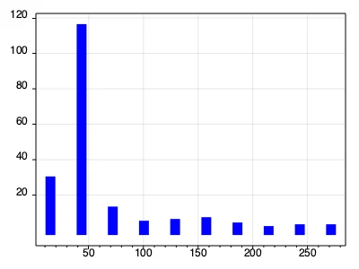
使用 Bars 繪圖
繪製 Duration 資料分佈狀態,分析 Duration 頻率
1
2
3
4
5
6
7
8
9
10
11
12
13
14
15
16
17
18
19
20
21
22
23
24
25
26
27
28
29
30
31
32
33
34
35
36
37
38
39
40
41
| Plot myPlot = new();
double[] durationsY = df.GetColumn("Duration");
int binCount = 10;
ScottPlot.Statistics.Histogram hist = ScottPlot.Statistics.Histogram.WithBinCount(binCount, durationsY);
BarPlot bars = myPlot.Add.Bars(hist.Bins, hist.GetProbability());
myPlot.Axes.Left.TickGenerator = new ScottPlot.TickGenerators.NumericFixedInterval(20);
foreach (var bar in bars.Bars)
{
bar.LineColor = ScottPlot.Color.FromColor(System.Drawing.Color.Blue);
bar.LineWidth = 10;
}
ProbabilityDensity pd = new(durationsY);
double[] xs = Generate.Range(durationsY.Min(), durationsY.Max(), 1);
double sumBins = hist.Bins.Select(x => pd.GetY(x)).Sum();
double[] ys = pd.GetYs(xs, 1.0 / sumBins);
Scatter curve = myPlot.Add.ScatterLine(xs, ys);
curve.LineWidth = 2;
curve.LineColor = Colors.Black;
curve.LinePattern = LinePattern.DenselyDashed;
myPlot.Axes.Margins(bottom: 0);
string filePath = "Histogram.png";
myPlot.SavePng(filePath, 800, 600);
|